JD Custom Designs

Moving the bar a little higher, one house at a time

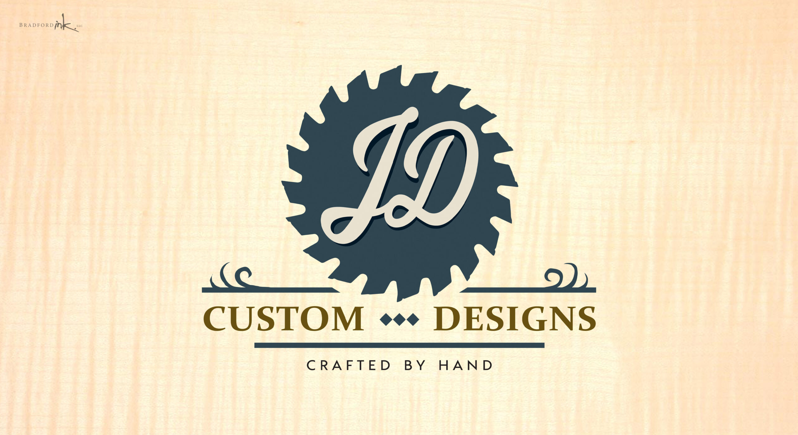
Bradford Ink was contacted by a fast growing 1-man woodshop in the Jersey area who needed a snappy logo to go with his fast growing furniture commissions and kids products.  It was critical that the logo felt down to earth, simple, and designed with tight organization and purposeful margins in the same spirit as a seasoned carpenter designing the careful proportions of his or her fine wares.  We gave a nod to the classic sawblade as a time honored symbol of a hard working shop, and added a balanced sense of character and handmade charm to top it off.

LOGO DESIGN

Chateaux Realty puts an emphasis on a top tier customer experience as much as exceptional results, so it was decided that the brand image needed to convey a luxurious and stately elegance that felt both understated and timeless.  Bradford Ink created a unique Fleur de Lis mark to cap off an ornate script lettering for the agency’s name.  The simplicity is both intentional and functional to allow the logo to be practically applied across a very broad range of realty uses.

CLIENT

JD Custom Designs

MISSION

New logo for a growing wood shop

HATS WORN

Designer and Fellow Woodworking Enthusiast