Matt Koski Landscape and Design

Branding from the turf up

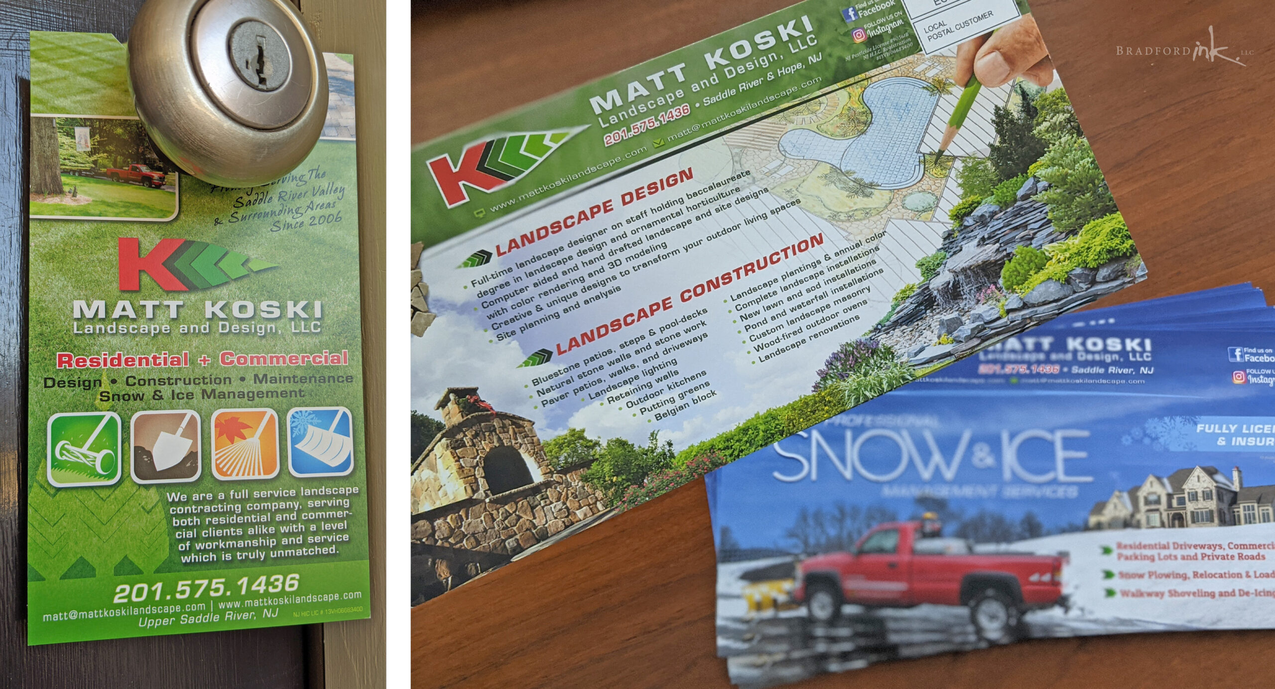
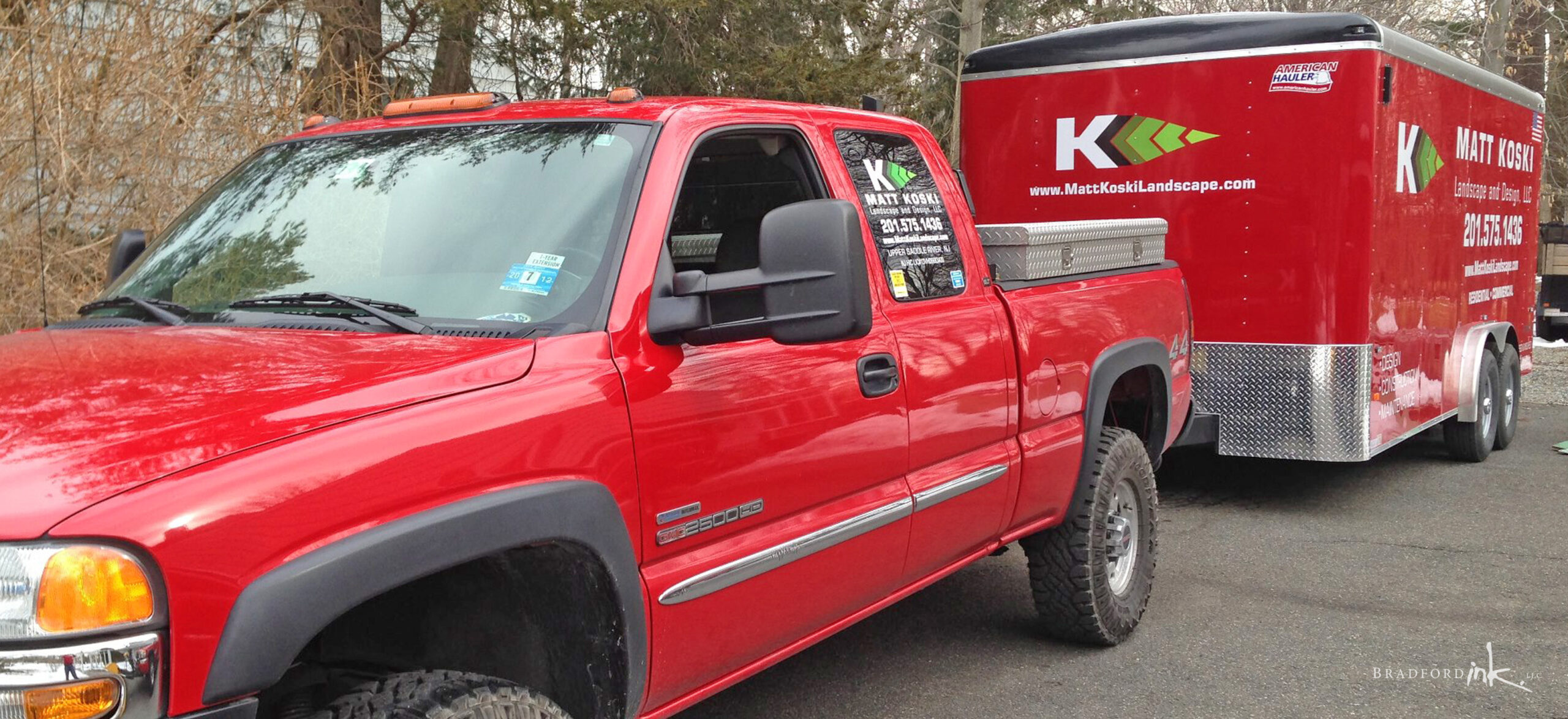
Bradford Ink was approached by Koski Landscape and Design to come up with a simple and impactful logo for their fleet and marketing use.  Bold leaf forms and thick linework help the branding to stand out in the field, and all marketing material was developed to really show off the customer’s skills with large photos and intuitive icon sets.

LOGO DESIGN

Utilitarian while still being pleasing to the eye, and easy to embroider or screen onto shirts in single color if need be.  Works will with client’s expansion plans as well, for Drainage, Farm, and Snow Removal gigs.

PRINT MARKETING DELIVERABLES

Marketing plan was to be achieved mainly through mailers, which involved a full service EDDM plan including researching USPS routes for best possible client profiles and working within a hardline budget.  Print items consisted of:

  • business cards
  • door hangers
  • newspaper ads
  • 6×11 double sided mailers

All items work seamlessly within a larger brand image and focus on clarity of information and bright, professional presentation of service images.

CLIENT

Matt Koski Landscape and Design

MISSION

Full branding initiative with emphasis on mailing campaigns

HATS WORN

Designer, ZIP code sleuth, Fresh Cut Grass Sniffer