Ryan Cassidy Group

Building a foundation for strong sales

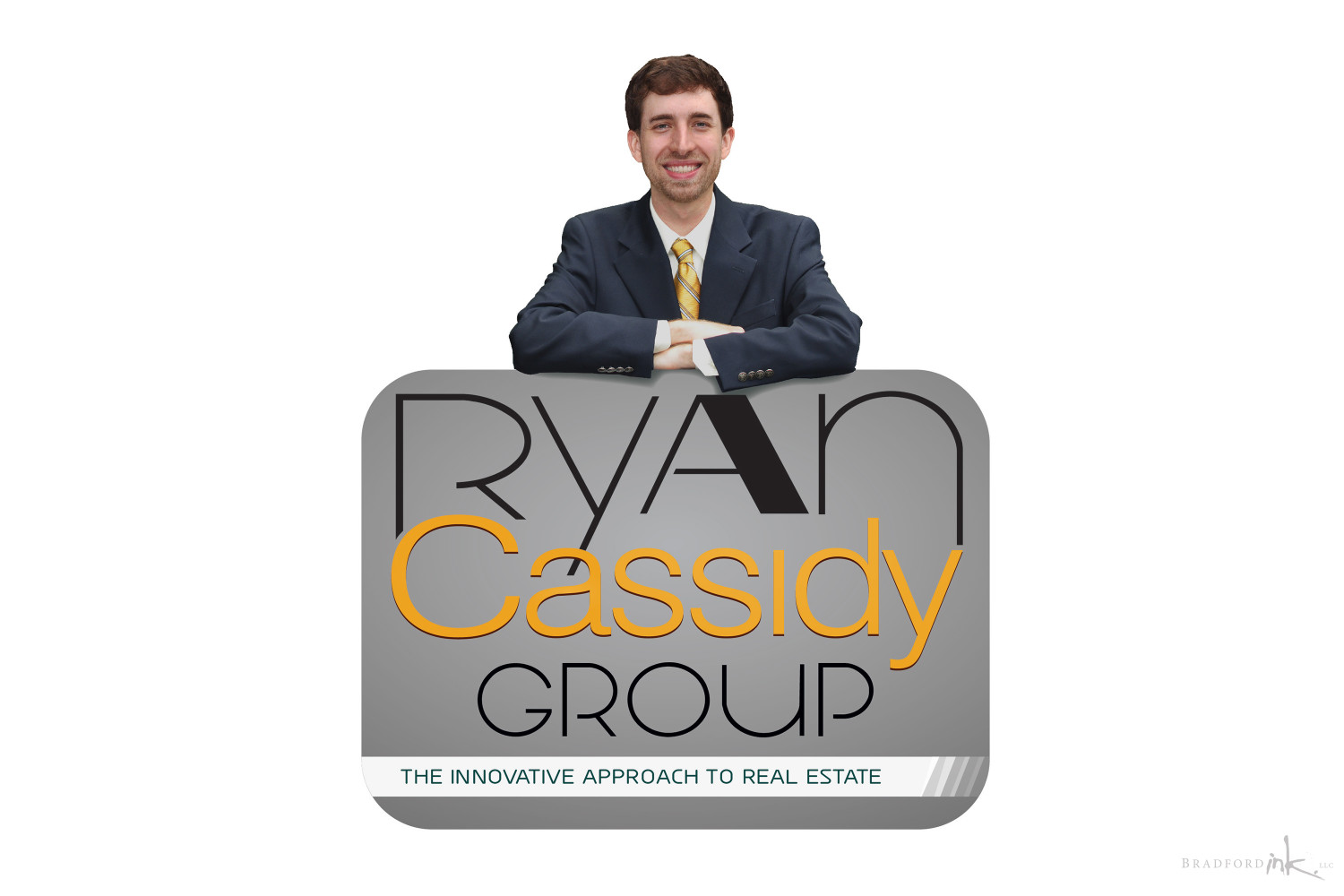
Bradford Ink was fortunate to connect with Ryan Cassidy Group while Ryan’s vision for his own brand’s future expansion was still in its infancy.  Having worked with Ryan over the years while creating designs for him at a different agency, the move to a unique, standalone brand of his own was a natural progression.  This perspective allowed Bradford Ink to inject Ryan’s personality into his new brand vision accurately and effectively.  Bradford Ink also deferred to Ryan’s market insights whenever possible, in order to understand how to best connect with a younger, more tech-savvy crowd that other realtors overlook.  This particular client/artist relationship exemplifies why Bradford Ink emphasizes time to personally connect with clients in order to achieve a successful design.

The Ryan Cassidy Group now employs a team of talented agents to handle their continuing growth in the Raleigh/Durham region through personable service, dependable results, and a highly professional image.

LOGO FEATURES

We focused heavily on Ryan’s younger, more tech-savvy perspective compared to many agents in the hotly contested NC Triangle market.  It was also critical to ensure that prospective clients understood Ryan’s cheery, amicable nature and eye-to-eye communication style that suits his dedication to the client’s needs, in contrast to the usual cold feeling that tech-heavy grpahics imply.  By mixing some more metallic shades with cheerful yellows and oranges, the result was a bold but professional aesthetic that helps Ryan’s growing agency stand out as an ongoing sales success in his region.

PRINT MARKETING DELIVERABLES

Part of the challenges faced in outfitting Ryan with the more impactful marketing materials included a wide array of collateral that could be used across advertising, sales, or home showing roles.  Items include:

  • business cards
  • letterhead
  • postcards
  • office window decals

It was important to maintain a clear graphic link between all of the different assets, starting with the highly contrasting grey and yellow color variations for the content body, and always integrating a clear image of Ryan as well.  A unique, modern font was employed to work in harmony with the broad, sweeping curves found throughout the graphics of the logo and supporting artwork.  White and Yellow highlights in strategic places help to build a sense of information hierarchy and add vibrancy when necessary.

SIGNAGE

No agent can be without their yard signs, so we immediately had to outfit Ryan with a unique sign design that would not only set him apart from some stiff local competition but also appeal to a wide variety of buyers.

Unlike most Real Estate companies, we had the freedom to choose some exciting sign dimensions and design a distinct, stand-out presentation free of the typical branding constraints since we were writing the rules as we went along!  Ryan’s sign is a generous 30″ x 24″ footprint and combines his welcoming logo composition with a clear, organized contact and social media information region as you move down the design.  Care was taken to ensure visibility and legibility of critical elements since many viewers will be seeing the sign at speed in a car.

WEB SUPPORT

Bradford Ink developed a simple website header and miniaturized version of the main logo for Ryan’s company site, high-traffic listings, and social media profiles to combine that last bit of polish with a little added visual punch.

PHOTOGRAPHY

Bradford Ink was able to offer a quick, successful photography session aimed at capturing an image that we could integrate into the logo design.  The resulting bevy of high quality, carefully edited images were useful across various media and came at a far more reasonable cost than employing outside photography services.

CLIENT

Ryan Cassidy Group

MISSION

Creating a brand identity and broad collateral suite from idea to conception

HATS WORN

Designer, Photographer, Photoshop Expert
cassidy-sign
cassidy-postcards
Cassidy-biz-cards