Seams & Grain

A Woodworking Home Run

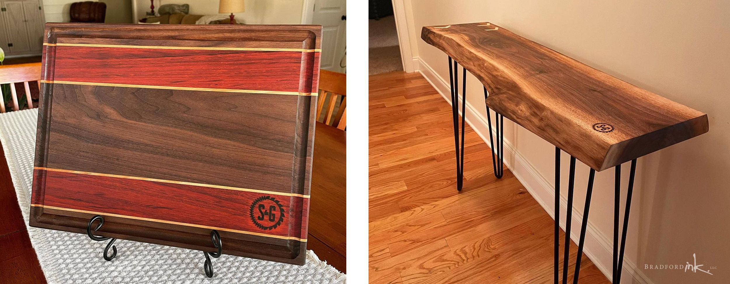
Seams and Grain brought together two very unique professions in a way that made the logo development a lot of fun.  We opted to capitalize on circular elements and settled on a logo form that was highly recognizable and had the unpretentious, down home iconography that felt like it could be right at home hanging off of a banner in the outfield.

LOGO DESIGN

Fun and straightforward, the S&G logo combines two very unique aspects of this craftsman.  A local friend, Bradford Ink was able to meet in person and understand the hard working enjoyment that goes on in both his shop and workplace.  Challenges including ensuring it was weighty enough to be a recognizable shape when branded onto work with a hot iron.

SOCIAL MEDIA

Logo shape and format was chosen partly for ease of implementation on Instagram, the client’s main advertising vehicle.

CLIENT

Seams and Grain

MISSION

Combine two unique professions into one logo

HATS WORN

Designer and Pinch Hitter