Hackett’s Meat Market

A modern approach to an old-world trade

Butchery is becoming a bit of a lost art these days, so when Bradford Ink was charged with finding a memorable identity for Hackett’s new store, it felt natural to lean on the basics with this design through implementing some hand-drawn artwork.

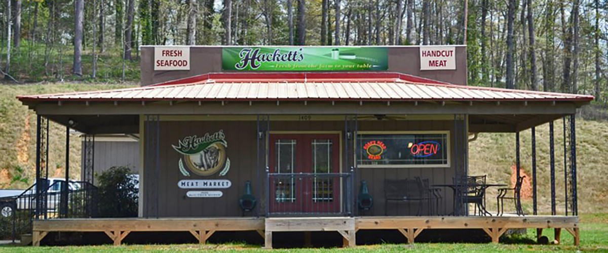
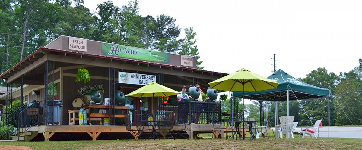
We also developed a suite of supporting artwork used on store signage.  Bright green tones and simple landscape elements were the solution for helping the store not only catch glances from the road, but also help convey an immediate understanding of fresh product and a welcoming atmosphere.

LOGO FEATURES

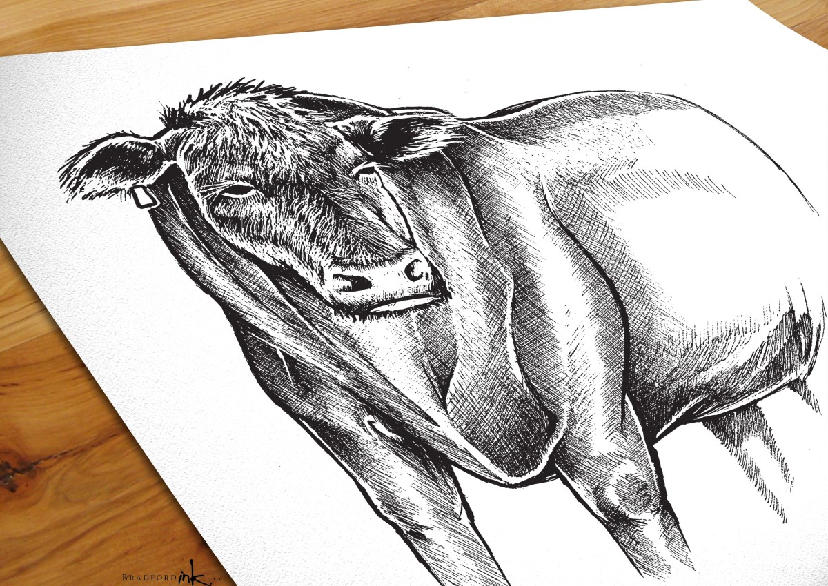
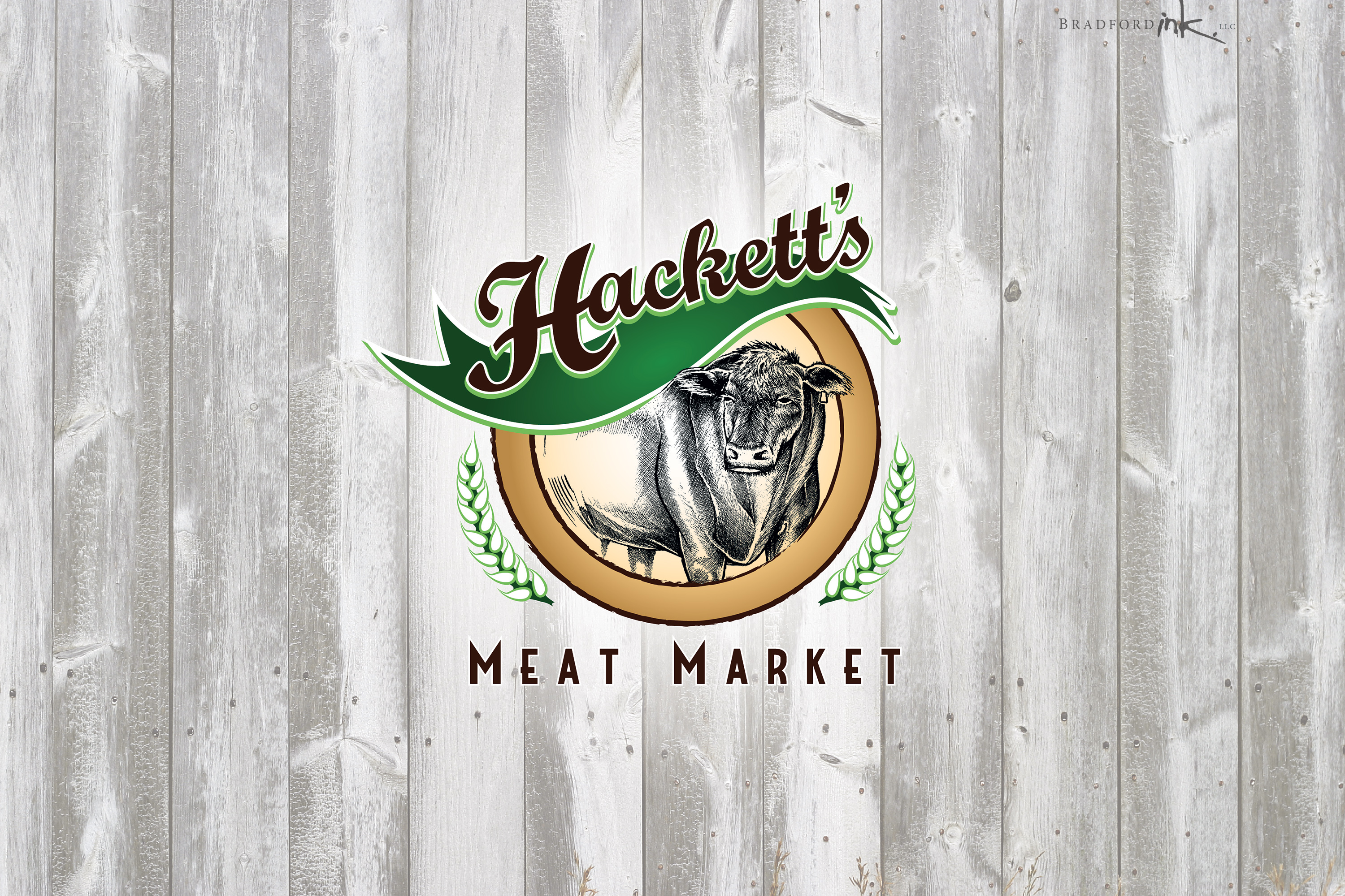
The organic earth tones encompass the main focal point of the logo, which is our big friendly Angus bull.  We wanted it to be clear that Hackett’s Meat Market is about an authentic, wholesome, and carefully prepped product….and he pretty much tells the whole story here.  In keeping with that mindset, the pen and ink bull illustration was lovingly crafted on paper and then transferred to digital.  The font choices and circular composition helped bring back some older industrial design cues to really round out the old school flair.

LARGE INSTALLATIONS

No store worth its salt (or fine meats) is complete without a compelling sign to set the tone and draw customers in.  Thankfully, we were able to address that aspect with a broad 14 foot sign installation on the meat market’s upper facade.  The artwork went right to the core of the business mission with bright, open fields and a quiet farm scene; “Fresh from the farm to your table.”

PRINT MARKETING

The last small item to round out the market’s design needs is a small tray-pack produce sticker, which features the logo and tagline over the same farm background as the outdoor sign.

CLIENT

Hackett’s Meat Market

MISSION

Company branding through logo and signage

HATS WORN

Designer, Hand-Drawn Illustrator
Hackettsstore
Hackett's-Bull-Illustration
Hackettsstore2